BTC Spot CVD Chart Analysis: Order Flow Signals for June 29
BitcoinWorld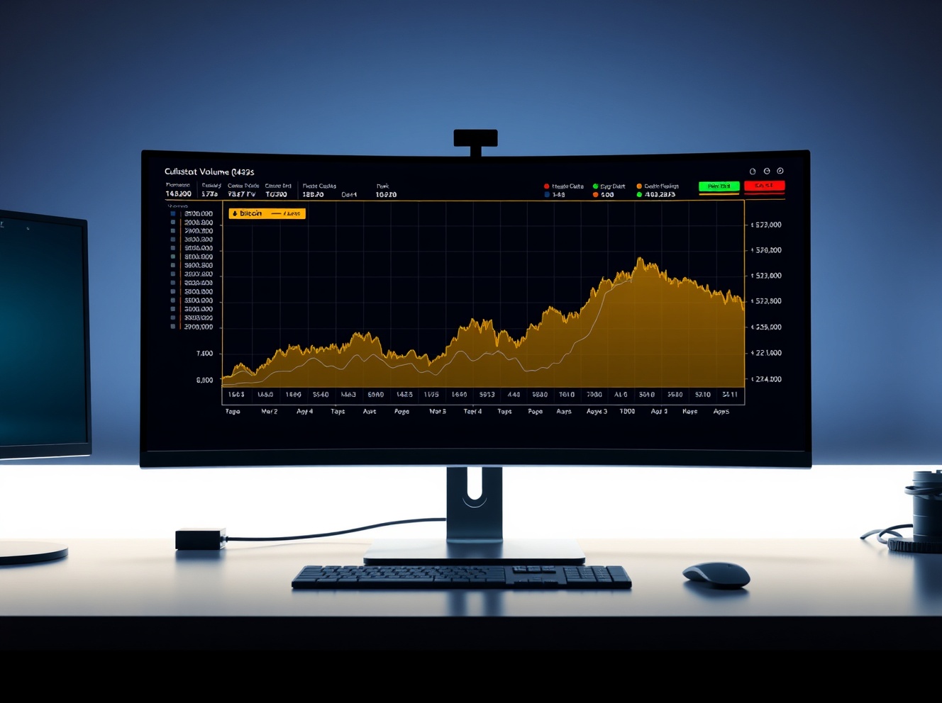
BTC Spot CVD Chart Analysis: Order Flow Signals for June 29
As of 12:30 a.m. UTC on June 29, 2025, the spot cumulative volume delta (CVD) chart for the BTC/USDT pair on major exchanges provides a granular look at order flow dynamics. This data, derived directly from the order book, helps traders assess whether buying or selling pressure is dominating at different price levels and trade sizes.
Understanding the Volume Heatmap
The top section of the chart displays a volume heatmap, which tracks the density of trades executed at specific price points. When the price lingers in a narrow range or moves sharply through a level, the heatmap background brightens, visually highlighting areas of concentrated activity. These brighter zones often act as technical reference points, potentially serving as support or resistance in future price action. For instance, a bright band near a recent high may indicate overhead supply, while a bright area near a low could signal buyer absorption.
Decoding the Cumulative Volume Delta (CVD)
The CVD indicator below the heatmap tracks the net difference between buying and selling volume, categorized by trade size. Each colored line represents a specific order size bracket. For example, the yellow line tracks orders between $100 and $1,000, typically associated with retail traders. In contrast, the brown line tracks large orders between $1 million and $10 million, often attributed to institutional activity or high-net-worth participants. When a CVD line rises, it indicates that buy orders in that size category are exceeding sell orders, suggesting aggressive buying. Conversely, a declining line signals selling pressure.
What the Data Suggests for Traders
By analyzing which trade-size cohorts are driving the CVD, traders can gauge the conviction behind a move. A price advance accompanied by rising CVD in the larger order brackets (brown and purple lines) suggests strong institutional support, which may increase the likelihood of a sustained trend. However, if the move is driven primarily by small orders (yellow line) while larger participants remain passive or sell into strength, the rally may lack follow-through. As of the latest reading, the CVD chart offers a real-time snapshot of who is buying and selling, providing context beyond simple price movement.
Why This Matters
For active traders, the CVD chart adds a layer of transparency to market structure. It helps differentiate between genuine accumulation and short-lived retail enthusiasm. While no single indicator is predictive, the combination of volume heatmap and CVD offers a data-driven view of market sentiment at a granular level. As always, traders should use this tool alongside broader technical and fundamental analysis.
Conclusion
The BTC spot CVD chart as of June 29, 2025, provides a detailed order book analysis, highlighting areas of high volume and the balance of buying versus selling across different trade sizes. This information is valuable for understanding current market dynamics, though it should be interpreted within the context of the broader market environment.
FAQs
Q1: What does the BTC spot CVD chart show?
The chart displays the cumulative volume delta (CVD) for the BTC/USDT spot pair, showing the net difference between buying and selling volume categorized by trade size, along with a volume heatmap.
Q2: How is the volume heatmap useful?
The heatmap highlights price levels where significant trading activity has occurred. Brighter areas may act as potential support or resistance zones due to the concentration of orders.
Q3: What do the different colored lines in the CVD represent?
Each colored line represents a specific trade size bracket. For example, yellow represents small retail orders ($100-$1,000), while brown represents large institutional orders ($1M-$10M). Rising lines indicate net buying pressure in that bracket.
This post BTC Spot CVD Chart Analysis: Order Flow Signals for June 29 first appeared on BitcoinWorld.


You May Also Like

Fed Governor Calls For Strong Stablecoin Oversight As CLARITY Act’s Final Text Gets Delayed

Global FinTech and the Future of Programmable Money